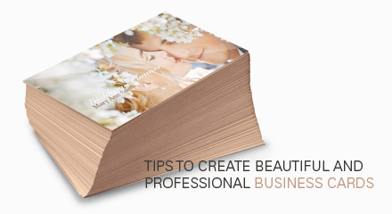
Business cards; every professional needs them. Most business cards have a rectangular shape and, depending on the country, will be around 3.5×2 inches; the perfect size to fit in your wallet. They carry your information and serve as a memory aid for your clients and prospects.
While most business cards are boring and quickly forgotten, some that are well-designed can make an impact on your clientele and help communicate a message. From “I’m boring” to “I’m a creative person” or “Hire me, I’m an expert”, every card has a personality and will leave an impression on your clients. Knowing this, you should make sure your business cards impart the right message, or else it might end up in the recycling bin along with hundreds of others.
So, what exactly should you consider when designing your next business cards? Here are some tips for designers, freelancers and motivated business owners who are interested in getting involved in the creation process.

Size, bleed, resolution and orientation
Business card sizes vary according to the country. In North America, the standard size is 3.5×2 inches though. If you use a software like Photoshop, you’ll have to add a small bleed to your document; that means an extra margin to ensure that, during the printing and cutting process, you won’t see any white paper around the edges if the machine or person in charge misses the spot by some millimeters. It happens more often than you think and I have yet to order a batch of business cards that all come out perfectly. The bleed should be from 1/8 to 1/4 of an inch. To make sure though, you should call your printer and find out.
Besides the size and the bleed, you’ll have to make a choice regarding the orientation of your business card; while most cards are horizontal, it doesn’t mean you have to follow that trend if you think of a great vertical design.
Last but not least, when working with printed material, you should set up your file to be 300 DPI (pixels per inch). 150 could do the work but the printed images might not come out as sharp as you would want.
Once you have all this, you’re ready to start creating!
Picking the right colors and typeface
Business cards, as I have stated above, are information holders. Every typeface and color has a personality of its own; they will impact the look of your business card greatly. For example, using a serif font generally means you like what is traditional and elegant, while sans-serif generally expresses simplicity and modernity. Of course within those categories are thousands of typefaces that were each created for their own purposes and you will want to look into them before making a choice. Make sure your typeface is legible and professional; there’s nothing more disconcerting than receiving printed material written in Comic Sans. You are a professional after all, not a child.
The colors you will choose will also impact your business cards. Every color has a signification. They vary from culture to culture, yes, but I can at least speak for North America when I say that blue signifies trust and friendliness while yellow is fun and joyful. There’s a reason for example why banks and similar institutions avoid using dark tones and blacks as a main color for their websites and promotional material; black is a color associated in the subconscious with concealment, darkness and fear. But if you like black and think you can pull it off in your designs, it can also mean elegance, refinement and mysticism. It’s really all about presentation in the end and the overall design of your business card will be what really matters.
Using good quality images
Earlier I spoke of using a 300 DPI resolution for your business card because otherwise it will print a low-quality, pixelated card. You definitely don’t want that. Well, you have to choose your images with care too, going for high-resolution pictures. Whatever you choose to use (a photo, drawing or else) you must never increase its size unless it is a vector image. Doing so will result in unwanted pixels and loss of detail. You can decrease the size as much as you want though so don’t be scared of using big images.
Paper quality
Lastly, once your card is ready to be printed, you will have to pick the right paper. Print-shops I’ve worked with usually offer 12 and 14pt (that’s the thickness of the paper) cardstock in glossy, semi-glossy and matte paper. While glossy will shine, you may leave your finger prints all over it. Matte and semi-glossy are good alternatives if that is something that disturbs you.
If you want something specific like thicker paper or rounded corners for example, most printers will offer these options for an extra fee. The best way to find out is to contact them and ask for a quote. Keep in mind though that the more options you add, the pricier it will get. In some cases, printing jobs can pass from a 3-digit to a 4-digit cost. So create in function of your budget.
Do you have questions, comments or anecdotes about business cards? Leave a comment!